Portfolio / Landing page designs / Neobank
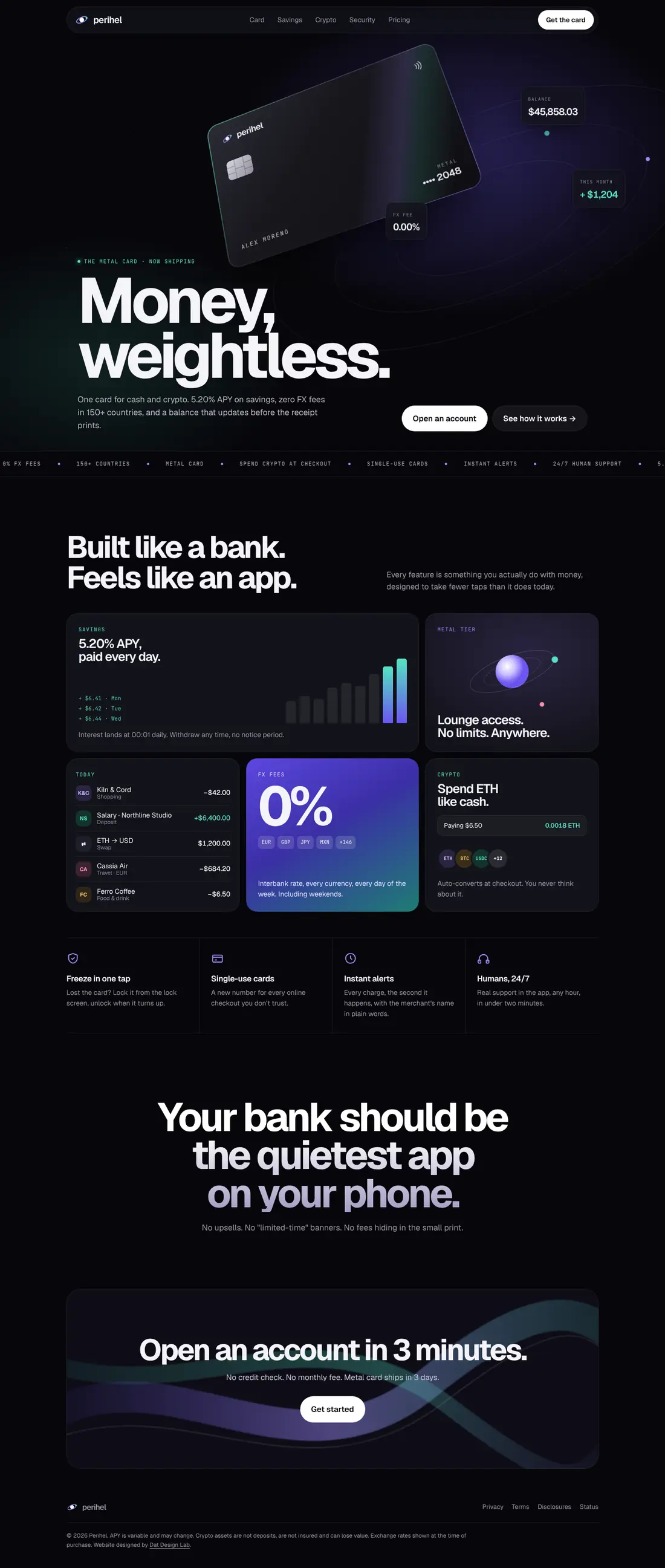
A landing page for a card that holds cash and crypto. Premium neobanks sell a feeling first, so this page stays dark and quiet and lets the numbers carry it: 5.20% APY and zero FX fees in 150+ countries.
 Hover to scroll

Premium finance brands earn trust through restraint. Every section here does one job, and nothing on the page tries to rush the visitor.
5.20% APY paid daily, the interbank rate in every currency, lounge access with no limits. Concrete numbers do more for a bank than any adjective.
Each tile is something you actually do with money (spend abroad, pay with crypto, freeze a card), designed to take fewer taps than it does today.
Freeze in one tap, single-use cards for checkouts you don't trust, instant alerts, and humans in the app 24/7. Safety is the feature, not the footnote.
"Your bank should be the quietest app on your phone." No upsells, no limited-time banners, no hidden fees. The tone is the differentiator.
Open in 3 minutes, no credit check, no monthly fee, and a metal card that ships in 3 days. Crypto risk disclosures are stated clearly in the footer.
I design landing pages and product UX for fintech and consumer apps.