Portfolio / Landing page designs / Savings app
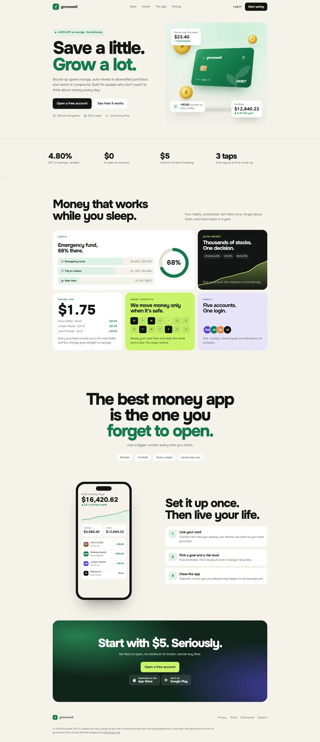
A landing page for a round-up savings and auto-investing app. Money apps live or die on trust, so this page sells calm: small amounts, automatic habits and a clear view of where the money goes.
 Hover to scroll

Fintech landing pages tend to shout: big returns, bright gradients, countdown banners. The people who need a savings app most are the ones that style scares off.
Instead of a vague hero shot, the page shows a goal in progress ("Emergency fund, 68% there") and round-ups landing. People trust what they can see happening.
Round-ups, auto-investing, a smart pause that skips the week rent is due, and family accounts. Each is a habit the app takes off your plate.
Link your card, pick a goal and a risk level, close the app. The whole pitch is that you don't have to think about it, so the setup can't look like work.
"Start with $5. Seriously." No fees to open, no minimum, cancel any time. The CTA lowers the stakes instead of raising the excitement.
Variable APY and investing risk are stated in plain, readable text. A finance page that hides its small print loses the visitors it most wants.
I design landing pages and product UX for fintech and consumer apps.